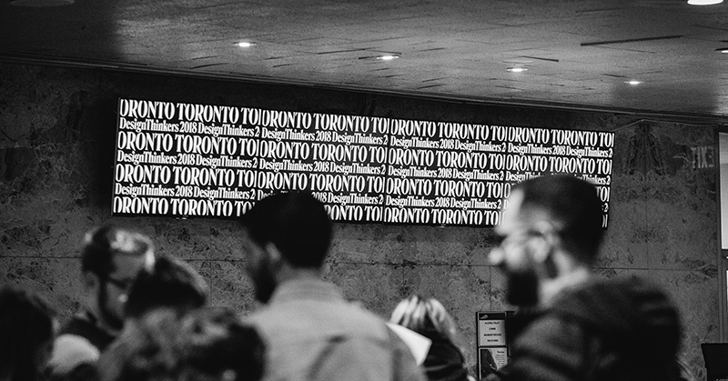
Back in October, our resident Graphic Designer Kevin Cascagnette (hey, that’s me!) had the opportunity to attend DesignThinkers Toronto, an industry leading conference put on by the RGD (Association of Registered Graphic Designers). More than 2,000 creatives participated in the event over the course of two jam-packed days. Forty-eight speakers dove deep into a broad range of topics, including “Augmenting The Everyday Through Design,” “NSFW: F*ck Your Office,” and “Interactions Speak Louder Than Words: The Role of Storytelling in UI Design.” The conference boasted design legends such as Jessica Hische, Bonnie Siegler,Alex Center, and Michael Beirut (MICHAEL FREAKIN’ BEIRUT) talking about their careers, their triumphs, and their shortcomings. Simply put, it was a remarkable two days.
So how can I chalk up two days worth of knowledge into three main takeaways? With blood, sweat and gin, I will try (*pours gin*).
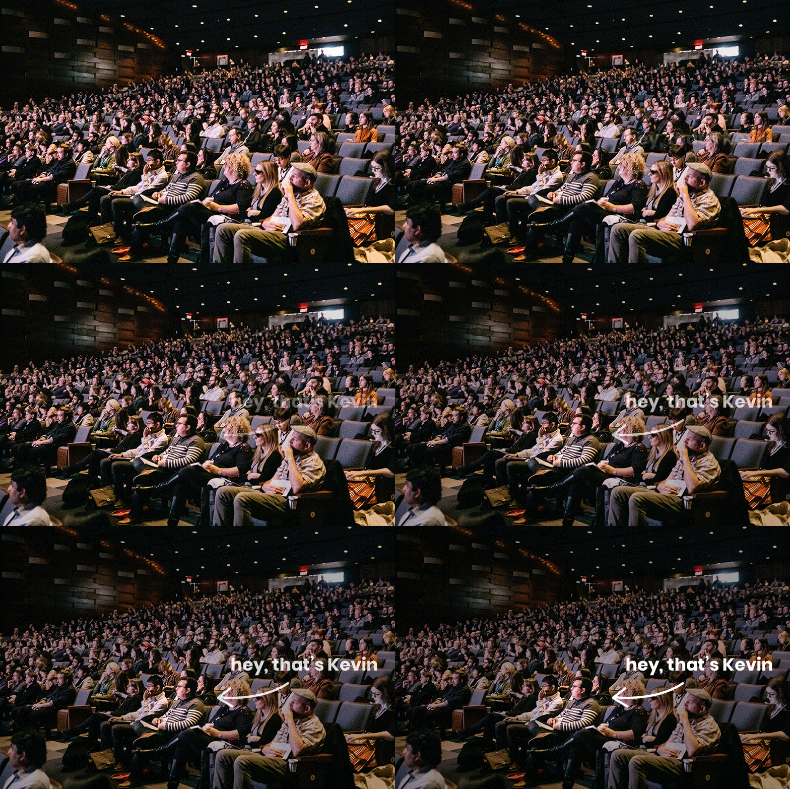
GIF of attendees and arrow pointing to Kevin Cascagnette at DesignThinkers Toronto 2018
Takeaway #1 – There’s a whole world of designers out there looking to collaborate, learn, and grow together.
When I first walked into the conference, I was struck by the number of people that were attending; there was a broad spectrum of design experience represented, everyone from young people studying design in school to seasoned pros looking for some fresh inspiration. It was amazing to watch a community form from this diverse group, with everyone excited to be among “their people.”
Over the two days, this collaborative group shared questions and tips and meaningful conversation, to the point that I learned almost as much from my fellow attendees as the keynote speakers. It reaffirmed a belief that everyone at Collaborative Haus shares: we’re better working together than working against one another.
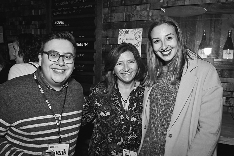
Kevin Cascagnette, Diane Torlone from Toronto, and Suzie Djordjevic from Detroit
The conference also proved that designers don’t take themselves too seriously; the number of designer jokes certainly proved that (example: designers always wear black, so of course a sign was posted with “Look a sea of people wearing black” above the large foyer area).
Takeaway #2 – Think critically & cohesively before you design.
This one seems like a no-brainer right? It is, but the need to think critically & cohesively was also something that the conference stated repeatedly. As designers, we have to ask questions of ourselves and our clients that might be uncomfortable. We’ve all been in situations where we’re not on the same page as someone we’re working with, and we need to remember that to have a clear understanding of a project you need to align yourself through common frameworks and language to meet your goals.
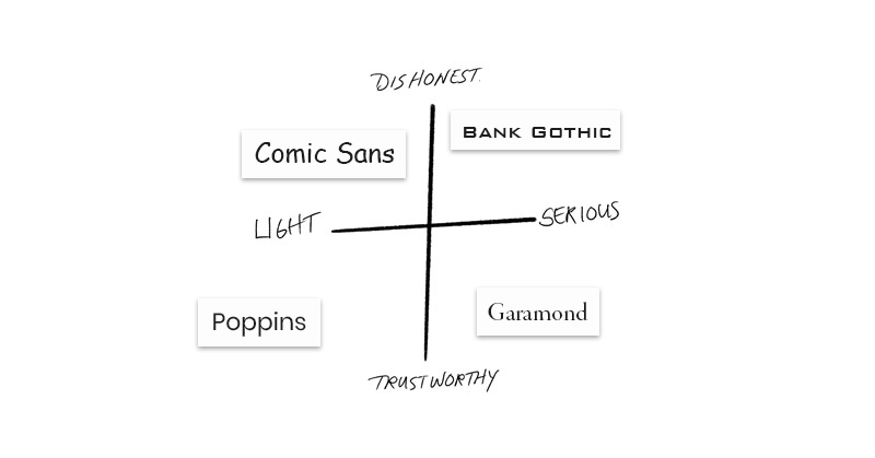
An example of this is trying to explain the visual design of “trustworthy.” Using words and language can help us understand what “trustworthy” looks like to person A or person B. While person A or B might be able to agree on words that describe trustworthy, they may also be on different wavelengths when it comes to what a “trustworthy” typeface looks like. It’s through processes like setting up a t-chart and having our clients lay out different font choices on the chart that we’re able to better visualize what “trustworthy” or “dishonest” might look like. In the case of the t-chart below, we see that we can also have the other axis help us narrow in on other traits the client wants their logo to represent like the ability to be taken seriously. By designing with expectation and fail-safes in place to help ensure we’re all thinking critically & cohesively, designs begin to take form in meaningful and impactful ways.
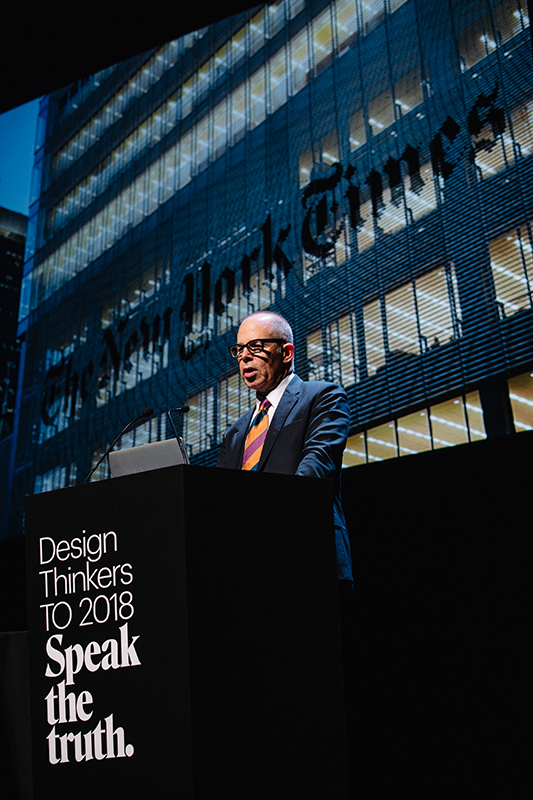
Michael Bierut speaking at Design Thinkers TO 2018
Takeaway #3 – Stay Inspired.
By the end of the first session of the first day, I had already realized how inspiring the conference was going to be, and it honestly felt as though the entire design world was focused in on the streets of Toronto. In addition to the inspiration by being surrounded by like-minded people, many of the talks focused on how successful designers had managed to stay fresh. What was their secret? How do you keep making magic when you’ve worked in an industry for close to 40 years (MICHAEL FREAKIN’ BEIRUT)?
The answer is in many ways was to stay inspired. Josh Higgins, Executive Creative Director at Facebook, said that “Art Inspires Community, Design Builds Community.” This quote helped awaken my mind to the fact that the art I had been admiring for years had a significant impact on my daily design work. The idea of searching for inspiration all around us can be a tired cliche but seems to ring true time and time again. These everyday inspirations are what fosters our creativity and challenges our perspectives.
Many of the speakers also spoke of personal projects that helped propel their creative thinking and expand their skill set. It was through these personal projects that designers were able to expand their network, improve their skill-sets, and understand what design looks like from our clients perspective. As Mitch Goldstein put it in his talk Unknowing, “I have started to understand more and more that my creative practice is not about knowing what I am doing – it’s about confidently not knowing what I am doing.” His philosophy of making for the sake of making has provided him with a myriad of creative opportunities both professionally and personally. Whether the project was playing with glue guns and Photoshop or working on campaigns, all of the speakers firmly planted in my mind the importance of “playing.”
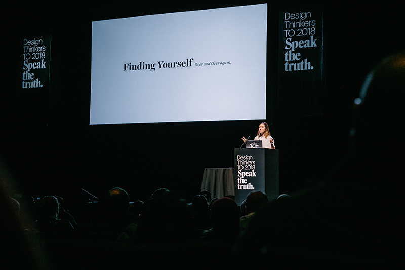
Jessica Hische speaking at Design Thinkers TO 2018
Blood, Sweat, and Gin
To try and capture the entire depth of what I learned, heard, and was inspired by into three main takeaways was next to impossible. With some of that blood, sweat, and gin I mentioned earlier, I hope I was able to brush the surface just enough that you were able to get a sense of how valuable it was to me both personally and professionally. Thanks for reading.
Photos by Connie Tsang Photography for RGD
BONUS Takeaway
In addition to all of the takeaways stated above, there was also a trade show element to the conference where I was able to learn about cutting edge print processes that could take any of your print marketing to the next level, so give us a call!

